Today we will begin exploring typography, which is the art of arranging type to make language visible. To fully understand typography, we will explore many different aspects of type, including the history of typography and how it has evolved throughout different time periods and developed in the digital age.
In today’s assignment we will discover and investigate four of the major categories of type
Objective:
- I can identify and explain the four major categories of typefaces.
- I can define Typography as a technique for communication and as an art form.
- I can define Typeface and Font and recognize the difference between the two.
- I can identify the categories of fonts and how they are best used.
Vocabulary Words:
- Type
- Typeface
- Font
- Serif
- Sans Serif
- Script
- Ornamental/Decorative/Display
- Typography
- Typeface versus Font
- Digital Typography
- Font Foundries
- Free vs. Paid Fonts
- Online Typeface Resources
Links:
Wikipedia – Typography
https://en.wikipedia.org/wiki/Typography
https://en.wikipedia.org/wiki/Typography
Wikipedia – Typeface
https://en.wikipedia.org/wiki/Typeface
https://en.wikipedia.org/wiki/Typeface
Wikipedia – Font
https://en.wikipedia.org/wiki/Font
https://en.wikipedia.org/wiki/Font
Paratype – Typeface Classification
https://www.paratype.com/help/class/
https://www.paratype.com/help/class/
Fonts.com – Type Classifications
Dafont.com – Free Fonts
https://www.dafont.com/
https://www.dafont.com/
Topics Discussed:
- Serif Fonts
- Sans Serif Fonts
- Script Fonts
- Ornamental/Decorative/Display Fonts
- Online Typeface Resources
Assignment:
- Using the web addresses above, find the definitions for each of the following:
serif type
sans serif type
script type
ornamental/display type - Use InDesign to create a document that introduces and explains each of the above items.
- Use a default 8.5″ x 11″ Letter size page.
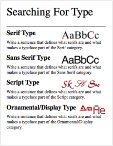
- Include a large headline for each category, and a one sentence explanation of the definition.
- Include a sample image to show me what each of the four type categories looks like.
- Try to put all of the four on one page!
- When you are finished, hand in your completed InDesign document and all the sample images you used to the Google Classroom page for this assignment.
Example:
Assigned: September 18th, 2017
Teacher Pacing Due Date: September 20th, 2017


