As a designer, good (or bad) design is all about the choices you make. One of the most important decisions you’ll make is what typefaces you will use to produce your headlines, subheadings and body text. Today we will practice making these choices.
Objective:
- I can select the most appropriate typeface available for a given design scenario.
Vocabulary Words:
- Type
- Typeface
- Font
- Serif
- Sans Serif
- Script
- Ornamental/Decorative/Display
Links:
None.
Topics Discussed:
- Serif Fonts
- Sans Serif Fonts
- Script Fonts
- Ornamental/Decorative/Display Fonts
Assignment:
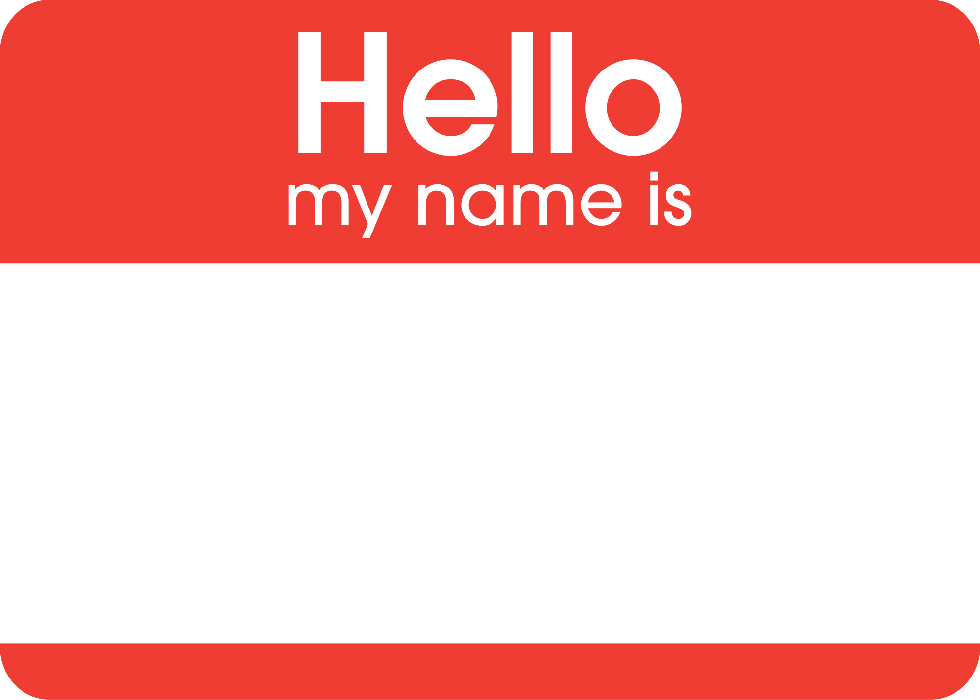
You’ve seen those “Hello! My Name Is…” badges, right?

They’re pretty generic. They use generic fonts and simple design to make them easy for anybody to recognize and use. What if we could personalize a Hello badge to fit our own personalities? Today, we’re going to use what we’ve learned about typefaces and the Principles of Design to redesign a Hello badge to reflect different aspects of our personalities. To do this, you will need to make important choices about how you arrange the page, what typefaces you would like to use, and what colors you would like to use to effectively communicate a message about who you are.
- Create a new InDesign document with the default size, but landscape orientation.
- Use the Pages palette to create four additional pages, for a total of five pages.
- Take a few minutes to think of five words that describe what you are. For example, you might use words like “student, teenager, athlete, musician, gamer, superstar, etc.” This will work best if you think of your own, so try to think of five nouns that best represent you.
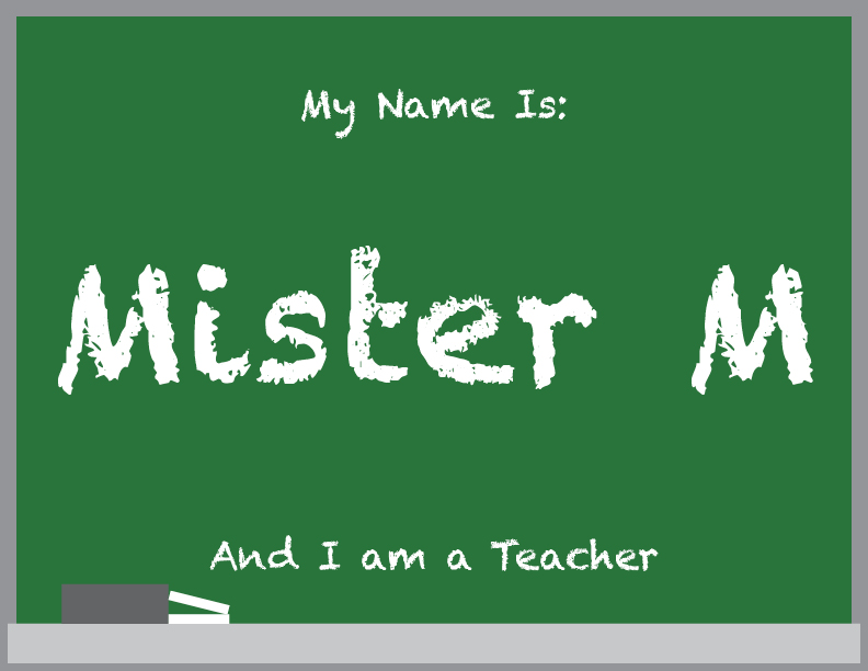
- On each page, type the words: “Hello” and “My name is”. Select a typeface and font size that makes these words easy to read, and make “Hello” slightly larger than “My name is”.
- In very large letters, type your name. Select an appropriate font for your name, and try to make your name fill the page without going over the pink borders.
- Finally, near the bottom of the page, type the words “and I am a _______.” Fill in the blank with one of the five descriptive nouns that you thought up for yourself.
- Fill in the background with a color, by creating a rectangle the size of the entire page and placing it on a layer below your main text layer.
- Use typefaces that look appropriate for the descriptive noun that you have chosen. For example, since I’m a teacher, I used a chalkboard font called “Chalkduster”, since chalkboards are commonly associated with teaching. I also changed the background color to a chalkboard green to give the idea of a chalkboard.

- Add any graphics or drawings that you would like to include to make your design more visually appealing. For example, I added the grey rectangle and the thin white rectangles on the bottom of the page to represent a chalkboard eraser and two pieces of chalk.
- Repeat this process on the following four pages for the remaining four words you have chosen.
- When you have all five pages finished, save the document as “Your name – Typeface Choices” and place a copy in the appropriate folder in StudentsTempFiles by Thursday, October 1st.
- Don’t forget: Thursday, October 1st is the deadline for all late or incomplete work. After October 1st, no late work will be accepted and grades will be finalized, so make sure your work gets turned in before the end of the day on October 1st.
Assigned: September 25th, 2015
Due Date: October 1st, 2015