Tag Archives: Term 3

HISTORY OF DESIGN – HELVETICA AND HELVETICA REFLECTION 2024

Today we will watch Gary Hustwit’s movie Helvetica, an independent film that explores not only the history and development of the Helvetica typeface, typography and graphic design in general, but also explores the dichotomy between the adherence to established principles of design and the desire to express one’s stylistic individuality and vision.

Objective:

  • I can watch the movie Helvetica to learn about the history of typography and design, and express my thoughts on design in a brief reflection piece.

Vocabulary Words:

  • Typeface
  • Modernism
  • Post-Modernism
  • Rational
  • Humanistic

Links:

Helvetica Film Website: https://www.hustwit.com/helvetica
Google Classroom: https://classroom.google.com

Topics Discussed:

  • Modernism
  • Grid Design
  • Rational
  • Post-Modernism
  • Humanist

Assignment:

  1. Today and Friday, we will watch Gary Hustwit’s Helvetica, an outstanding independent film that documents the development of the typeface Helvetica as well as the history of graphic design as we know it today. We will watch the first half today, and the second half on Tuesday.
  2. Despite its original intent, Helvetica is a typeface that inspires strong opinions in graphic designers, both positive and negative. As you watch, notice how incredibly common the use of the typeface really is, and ask yourself how the sheer ubiquity of its presence makes you feel about Helvetica. Do you love it, do you hate it, or are you somewhere in between?
  3. Helvetica also explores the historical (and ongoing) struggle between the Rationalists who invented the principles of design that we studied earlier this year (and continue to use today) and championed the development and use of Helvetica, and the Post-Modernists who completely rebelled against these rules and sought to create type using anything except Helvetica. Which side do you prefer? Are you a structured rule-follower or a dynamic rule-breaker?
  4. Visit the Google Classroom and Open the “Helvetica Reflection 2024” Form attached at the bottom of the latest post.
  5. Answer each of the questions in the document using complete sentences. As always, please avoid using abbreviations, acronyms or “text speak”.
  6. You must have at least one complete sentence for each question in each prompt. (If you see two question marks, you need at least two sentences!)
  7. When you are finished, submit the form. If you need to go back and edit your answers, you can revisit the form page and change your answers anytime.
  8. Please submit this form to me before end of day on Friday, February 16th.
  9. Enjoy the show!

Assigned: February 15th, 2024
Teacher Pacing Due Date: February 16th, 2024

Type Week: Typeface Anatomy

Objective:

I can use the Internet to find out more about the different parts of letters and what these parts are named.

Web Links:
A-Z Anatomy of Type
Type Anatomy: A Visual Guide to the Parts of Letters

Topics Discussed:

  • Typography
  • Letter Anatomy
  • Uppercase
  • Lowercase
  • Small Caps
  • Baseline
  • X-height
  • Ascender
  • Descender
  • Serif
  • Terminal
  • Stem
  • Crossbar
  • Bowl
  • Counter
  • Shoulder
  • Ligature

Assignment:

Visit the A-Z Anatomy of Type webpage or the Type Anatomy: A Visual Guide to the Parts of Letters in the links provided. Read through the articles to learn about Letter Anatomy, and the standard set of names for the parts of a letter.

  1. Open your Text Week document in Illustrator and go to the fourth (lower left) artboard.
  2. For each of the fifteen vocabulary terms:
    • Create a headline in Point Type with the vocabulary word itself
    • Use Area Type to write the definition of the vocabulary word. Use complete sentences, and you may copy and paste definitions (Just make sure you are copying the correct definition!).
    • Use Point Type and the line or shape tools to demonstrate what each of the vocabulary terms looks like. Use the pictures on the website as a guide, but DO NOT copy the website’s images into your document. Use a red-colored stroke on your lines and shapes to show the part of the letter the vocabulary word is describing.
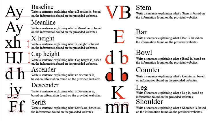

  3. You should have a headline, a definition and a graphic for each of the following terms:
    • Uppercase
    • Lowercase
    • Small Caps
    • Baseline
    • X-height
    • Ascender
    • Descender
    • Serif
    • Terminal
    • Stem
    • Crossbar
    • Bowl
    • Counter
    • Shoulder
    • Ligature
  4. Save your document. Make sure that you have all four Artboards completed, and turn it in to today’s Assignment Post in our Google Classroom to complete the Typography Week activities.

Assigned: February 13th, 2024
Teacher Pacing Due Date: February 14th, 2024