Tag Archives: Color Theory

Intro to Typography – Typeface Choices 2026 (Hello, My Name Is…)

As a designer, good (or bad) design is all about the choices you make. One of the most important decisions you’ll make is what typefaces you will use to produce your headlines, subheadings and body text.   Strong typeface choices set the appropriate tone for your intended message, while inappropriate typeface choices send conflicting messages and can disrupt the message you intended to communicate.   Today we will practice making strong typeface choices.

Objective:

I can select the most appropriate typeface available for a given design scenario.

Vocabulary Words:

  • Type
  • Typeface
  • Font
  • Serif
  • Sans Serif
  • Script
  • Ornamental/Decorative/Display

Links:

None.

Topics Discussed:

  • Serif Fonts
  • Sans Serif Fonts
  • Script Fonts
  • Ornamental/Decorative/Display Fonts

Assignment:

You’ve seen those “Hello! My Name Is…” badges, right?

2000px-Hello_my_name_is_sticker.svg

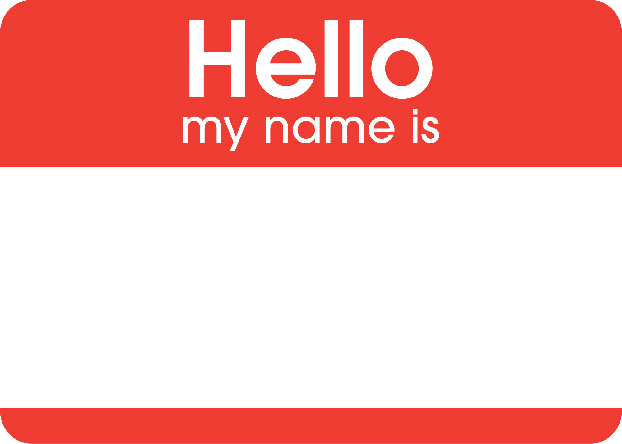
They’re pretty generic. They use generic fonts and simple design to make them easy for anybody to recognize and use. What if we could personalize a Hello badge to fit our own personalities? Today, we’re going to use what we’ve learned about Typefaces and the Principles of Design to redesign a Hello badge to reflect different aspects of our personalities. To do this, you will need to make important choices about how you arrange the page, what typefaces you would like to use, and what colors you would like to use to effectively communicate a message about who you are.

  • Create a new Illustrator Web document, with four artboards and landscape orientation (wide, not tall).
  • Take a few minutes to think of four words that describe you. For example, you  might use words like “student, artist, athlete, musician, gamer, superstar, etc.” This will work best if you think of your own, so try to think of four nouns that best represent you.
  • On each page, create a headline containing the words: “Hello” and “My name is”. Select a typeface and font size that makes these words easy to read, and make “Hello” slightly larger than “My name is”.
  • In a single, very large headline, type your name. Select a font that is appropriate for your name, and try to make your name fill the page without going over the Artboard margins.
  • Finally, near the bottom of the page, type the words “and I am a _______.” Fill in the blank with one of the four descriptive nouns that you thought up for yourself.
  • Fill in the background with a color, by creating a rectangle the size of the entire page and placing it on a layer below your main text layer. Lock this layer to protect your background.
  • Your goal with this assignment is to choose typefaces and page design elements that look appropriate for the descriptive noun that you have chosen. For example, since I’m a teacher, I used a chalkboard font called “Chalkduster”, since chalkboards are commonly associated with teaching. I also changed the background color to a chalkboard green to give the idea of a chalkboard.
mmchalkboard
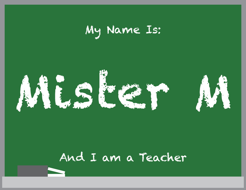
  • Add any graphics or drawings that you would like to include to make your design more visually appealing. For example, I added the grey rectangle and the thin white rectangles on the bottom of the page to represent a chalkboard eraser and two pieces of chalk.
  • Repeat this process on the remaining three Artboards for the remaining three words you have chosen. At least one of the Artboards should use the custom typeface that you created yesterday on the Calligraphr website.
  • When you have all four Artboards finished, save the document as “Your name – Typeface Choices”, and upload the Illustrator document to the Google Classroom assignment post by the end of the day on Wednesday, February 25th.

Assigned: February 23rd, 2026
Due Date: February 25th, 2026

Color Theory – Spring 2026, Day 4: The Meanings of Color

Objective:

I can use web resources to discover the meaning of colors, and the psychological effects of colors on people, so that I can more effectively apply color to communicate an intended message.

Web Links:

Color Matters: The Meanings of Colors: 
https://www.colormatters.com/color-symbolism/the-meanings-of-colors

Color Meaning, Symbolism and Psychology: https://sensationalcolor.com/color-meaning-psychology-symbolism/

Topics Discussed:

  • Color Theory
  • Hue
  • Warm Hues
  • Cool Hues
  • Neutral Hues
  • Psychology
  • Semiotics
  • Culture

Instructions:

Semiotics is the study of signs and symbols and how they are used. Use the websites below to read about the meanings and symbolism of the colors we have been discussing in class:

https://sensationalcolor.com/color-meaning-psychology-symbolism/

https://www.colormatters.com/color-symbolism/the-meanings-of-colors

Read about the symbolism and meanings of the warm colors Red, Orange and Yellow, the cool colors Green, Blue, and Purple, the more-versatile-than-you-know Pink, and the neutral colors Black, Brown, White, and Grey. We will discuss these meanings in class.

Next, on your fourth and final artboard, use your knowledge of Color Theory and Color Harmonies to demonstrate some of the cultural and psychological associations of the major hues discussed in class.

  1. Follow along with the class presentation on the meanings of colors.
  2. Design a document that describes some of the cultural and psychological associations related to each of the following colors:
    • Red
    • Orange
    • Yellow
    • Green
    • Blue
    • Purple
    • Pink
    • Brown
    • Black
    • White
    • Grey
  3. For each of the above listed hues, include the following:
    • A shape filled with the color, representing the pure hue.
    • A text box with at least one complete sentence describing some objects associated with the color.
    • A text box with at least one complete sentence describing some of the psychological associations with the color.
    • A text box with at least one complete sentence describing a fun fact you learned about the color.
  4. The background should be any color except white.
  5. The document should contain a headline containing a few words describing the main topic of the poster (i.e. “The Meaning of Color“).
  6. You should use the principles of Contrast, Repetition, Alignment and Proximity in the development of this poster.
  7. You should use these principles to make the poster interesting and fun to look at.
  8. You may use the Color Wheel you designed in our previous assignment as a guide to the hues, and you may copy and paste information from the provided websites, as long as you give the site credit on your page. (Add a text box with the word “Source:” and a link to the website somewhere on the page.)
  9. Save your Illustrator Week 4 document with all four completed artboards from this week and the previous week, and turn it in to the “Color Theory Week Activities” assignment post on our Google Classroom by end of day tomorrow, February 13th.

Hints and Tips:

  • If you’ve forgotten what Contrast, Repetition, Alignment and Proximity mean, review your Principles of Design notes from last semester, or the book chapters available on this website.
  • Fill the page with color, but choose your colors wisely! Your background color should not conflict with the hues you are trying to showcase!
  • You may design the page any way you wish, but you may wish to look at the Color Theory for Designers link for ideas on how to arrange your page and what background colors to use.
  • Don’t steal! If you copy information from one of the websites, you need to include a reference link to the source.
  • Do your best to make this page interesting and fun to look at! There are already far too many boring and ugly posters on campus already. Don’t be a part of that problem, be part of the solution.

Assigned: February 9th, 2026
Teacher Pacing Due Date: February 12th, 2026